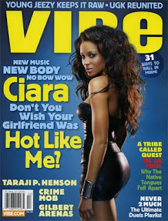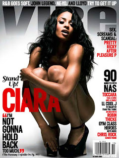

Again, the two magazines are of ‘Vibe’ magazine and both feature the same cover artist, this time the female R&B artist Ciara.
The edition on the left has cover artist wearing a tight, short-skirted dress with long, luminous hair, standing tall and posing by her side to emphasise on the fact that she is a ‘Diva’ and a ‘Superstar’. The edition is trying to give out the sense of sexiness and lust for the magazine, as she is what is ‘Hot’ in the industry at the moment, and it also portrays her as being a strong, proud woman due to the way she is standing and posing. There is also strong lighting used to shine off her dress, thus also highlighting the fact that she is indeed ‘shining’ at the moment, figuratively speaking, and is truly a ‘Superstar’.
The edition of ‘Vibe’ to the right however is placing a great deal of emphasis on her sex appeal and lustfulness by posing her naked, however covering herself with her arms to prevent from being completely exposed, yet still teasing enough to be more than eye candy for the male audience. She is crouching on the ground, showing a more ‘down and dirty’ feel to both her and the magazine, this effect being complemented to the use of dark shadowing and contrasting lighting to the image.
The background for the first edition is of a royal blue, and there is a strong use of yellow and sky blue for the writing. This not only connotes a theme of richness and wealth fitting to her ‘Diva’ appeal, it also provides a sense of freshness and the bright, bold colour of the yellow also help give a more positive undergo to the theme, and is much more appealing to teenagers due to this. The font also helps to add to this effect, as it is very big, and quite rounded, and like typical ‘bubble writing’, helping to allow itself not to be so serious and boring, but more exciting, eye-catchy and fun. A sub-title used in the front cover reading ‘Don’t you wish your girlfriend was Hot like me?’ allows the magazine to appear more silly and youthful, cleverly using a popular chorus of a famous R&B song. There is also a humorous use of alliteration used on the cover where it says, “New music, New Body, no Bow Wow”. This wit and hilarity helps to appeal to a younger audience of teens more, and the effect of vastly varying font size also adds to the unorthodox sense on things connoting freedom, eccentricity and going ‘against the norm’.
The background for the second magazine on the other hand, is of a grey, black and white theme symbolising the more mature nature of things now, as things are no longer silly and youthful, but now much more adult and explicit. The colour theme also gives a keen sense of classiness and formality due to the slight change in theme of the magazine. This is also clear with the bold, intense red text on the cover, which connotes not only danger, but also lust, sex and fame. The main sell line being Ciara, is also used effectively due to the fact that parts of the letters are being covered underneath Ciara’s arms, conveying the sense of lust, teasing and mystery for the magazine as things are yet to be uncovered in the articles within the magazine. The fonts are also very mature and formal due to the adult nature, and some of the sell-lines such as ‘Sex, screams & scandals’, are used as effective display of alliteration and also fits into the adult, mature, promiscuous and mysterious theme. An ironic sub-title reading ‘Stand Up!’ also works well as we can see that our cover artist is presently crouching, but not only does this slight humour add for appeal, the phrase ‘Stand Up!’ is also a very basic but powerful command, taking a serious and demanding undertone and adding to the simplistic but mature temperament of the magazine. The floating quote used reading “I’m not gonna hold back too much” is used to give somewhat of a double-meaning, as it can imply and insinuate the fact that she (Ciara) is more or less completely naked, however still using her arms to cover herself from being totally exposed, which is what is also subtly supposed to also represent her cover story for the edition as well, therefore making the magazine warrant a purchase to an even greater extent. Although the effect of only making the words ‘Not gonna hold back’ in big and bold text somewhat denotes that both the magazine is going to go all the way and to the limit with things, along with the cover artist, making the magazine seem much more intense and profound than it really is, allowing it to seem incredibly gritty, exploiting and straight down to the point, with the articles it presents. Thus again, adding to a sinister, adult nature to the edition, even though knowing teenagers may be even more enticed to buy the magazine for this reason as well, due to the idea of teens wanting to grow up into adults sooner rather than later, so wanting to take a taste and ‘bite’ into adult life by purchasing the magazine.
No comments:
Post a Comment