
These are double page spreads of the hip-hop magazine, ‘RWD’; and the rock music magazine, ‘Kerrang’.
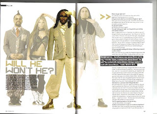
Throughout the article of ‘RWD’ there is a distinct colour scheme that flows within the pages. Gold, white and grey are the colours most present and this colour pattern is reflected within the main images of the artists in the spread. The gold highlights the richness of their talent, and the royalty and prestigious values of the group, whereas the grey could be used to symbolise the maturity, class and unpretentious originality of the group, as grey is a plain, simplistic colour formed of a mixture of black and white, two colours that can also portray a down-to-earth persona. The colours happening to match the costume of the artists also simply creates for a far more aesthetically appealing look towards the magazine, and generates a vivid pattern and theme towards the edition of the magazine. They are in front of a white, plain background in order to maintain the sense of simplicity that they may have been going for, and sometimes adding too much to he background can create a clustered effect which can be distracting and disorientating towards the reader, making them focus too much of the background and not enough on the actual main images and text. The artist Will.i.am happens to stand out specifically in lighting and gold, as he is the main lead towards the group, and therefore this conception has been effectively and efficiently pinpointed in the spread.
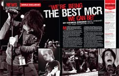
The article of ‘Kerrang’ also effectively uses a colour scheme through the pages, with the key colours being red, black and grey. The genre of the magazine is that of rock, therefore the red heavily connotes this, as it is often a colour to symbolise a sign of danger and urgency, which is the vibe that is often purposely portrayed throughout rock music. The black background and grey/ black and white tone to the artists also gives off a dark and mysterious façade to the double page spread, which allows it to represent the rock genre more vividly as these qualities also represent it to a high degree.
The title ‘Will he. Won’t he?’ is very effective as it is not only representative of the colour scheme that has been produced within the double page spread, but it is also very representative to the main artist within the images of the double page spread. The main artist’s name being ‘Will.i.am’, the double page spread has allowed itself to affiliate more personally with him. It is a polysemy and has a diverse meaning to it as it is playing with his name and would suggest perhaps a mystery of whether or not he will change or not, and may possibly be the main topic within the article. It is also very effective due to the use of devices present within it. The line ‘Will he.’ is shown in gold text, while the latter part of the question is shown in grey text, emphasising on the fact that the lines contradict each other strongly. The use of alliteration and repetition within the question also forms a more powerful impact to it; as it becomes easily attached and stuck in ones head, due to the rhythm and tempo in which it can be said and the recurrence of the same letter and word being used.
The title being used in the ‘Kerrang’ magazine is also very effective, showing a floating quote that reads, “We’re being the best MCR we can be!” This can hold heavy impact upon the reader and draw them in as the quote as been immediately highlighted to catch the reader’s attention, therefore making them want to read into the article and find out what else the artists had to say. This quote is very demanding and powerful, as it is already presenting the band as this due to the word “best” being used and their claim to be the best to their ability. This part of the quote is also highlighted in a bigger, bolder and white text, (compared to the smaller, red text) showing its importance and significance.
For both magazines, the range of magazines happens to show and present the artists with intense and distinguished character. The double page spread for ‘RWD’ presents the artists all in the same height level, meaning that although their may be a clear main artist to the group, illustrated by the highlighted colouring on this artist, all the artists are still equally important and significant into making the group what it is. This is also depicted by the concept of having each artists posed in their own individual way, meaning that they all have their own persona and character to bring to the group, which is what truly makes the group whole.
Although the ‘RWD’ article is clearer in showing importance and uniqueness of each artist to the band, the ‘Kerrang’ article helps to create a far more authentic vibe and temperament to the artists, and the images also have an incredible amount of character to them. None of the images shows the artists actually directly looking at the camera, making everything seem much more natural and brings a more vibrant sense of realism and immersion. It shows them in the studio and the booth producing their work, and therefore also conveys a more down-to-earth feel to the article, in assistance to the partial black and white colour scheme to the article as well.
The layouts of both texts are simple, and easy to read which is a key feature to making a successful article, as there would be no point in the article whatsoever if the person trying to read it was having massive problems reading it, or even to an extreme extent not being capable of reading it at all.
No comments:
Post a Comment