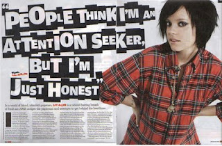
This is an article of the popular music magazine, ‘NME’, and consists of the artist Lily Allen being the main focus to the article.
In this article there only happens to be one main image present, and it is of Lily Allen and is incredibly large, taking up a full page all to itself. This is to show and emphasise upon heavy importance to Lily Allen as the main artist, and allows the viewer not to get disorientated at all by anything else; the attention always lies on her. The image displayed shows Lily Allen with her hands to her waist, and wearing a plain shirt, with the black hair and dark make-up. These features are important to the mise-en-scene for the article, and help to create the ideal image that they are looking for within the edition of the magazine, as she is presented to be a rock star. This is conveyed due to her posture, with her hands on her waist it can be implicated that she has little care for what is going on, giving her a rebellious sense of attitude, all from one picture. This is also displayed through her costume, as the plaid shirt is often affiliated with the dress sense of a rock star/ pop rock artist and the dark make up and pitch black hair further illustrates associates her with the rock culture and views her to be disobedient, due to her being against the norm. She is not wearing a fancy, glamorous dress with bright make up but instead much the opposite, which therefore conveys her to be exactly that.
The title to the page is a floating quote, which says, “People think I’m an attention seeker, but I’m just honest”. This quote is used powerfully in this context as it actually challenges the general and stereotypical, conventional views that people may hold over an artist in this specific genre of music. Since rock music is viewed to be very loud, chaotic, exciting and ‘messy’; it would not be unlikely for somebody to view Lily Allen as indeed being an attention seeker, however she has just outright told us that this is not what she is at all. We as the reader would be interested to read more into the article, to understand the artist that is Lily Allen more, as she doesn’t seem to fit into the stereotype and is therefore unique. So there is more to her that meets the immediate eye, making us curious and wanting to learn more. The quote also however reflects the personality that she is exhibiting through the image. It actually can be seen to be very ‘in-your-face’ and confrontational, due to the impression of her seeming to tell it how it is, to the grittiest of details, without willing to smoothen around the edges. This point also being accompanied by the fact that she is the only image on the pages, and is humongous, making her appear even more ‘in-your-face’. Yet, apart from these points, it still shows how much of a down-to-earth person she is, which would make us want to know her better through reading the article.
The form of the text, through the title is very conventional, yet unique, and fitting to the stereotype of the rock scene. It is presented in an imitating state of newspaper cut outs of letters, to form the writing. This creates a more dangerous and unsafe mood as this is something that criminals normally do, due to nobody being able to trace their handwriting. This makes the artist appear very delusional, and almost psychopathic as her speech is being presented as that of a criminal’s, therefore we get to judge her as being mischievous, dangerous and crazy, fitting to the ambience of the magazine. It adds to her confrontational, rebellious persona and fits into place with the feel of the magazine on a whole.


