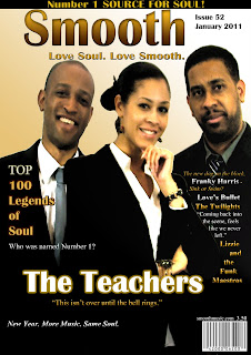
- A distinctive colour scheme consisting of cream, gold, black and white mainly which is to associate itself with an adult audience & that of Soul music, due to the provision of warm, sensual, classic and elegant colours all providing more sophistication as well.
-Plenty of Cover lines that will attract the reader and provide them with more initiative and intent of buying the magazine if they are on the fence about it.
- The Mise-en-scene aspects consists of the artists smiling and addressing the audience by looking into the frame, which can draw in the viewers and feel more involved. They also manage to hold their own individual poses and expressions to represent the artists as having their own unique style and personality, that the audience could be curious to explore. The age and race of the artists consist adult, Black artists. This is to make sure the magazine fits into the stereotype and convention of the Soul genre, which would therefore attract the larges audience among this convention as well, as most Soul music consumers would most likely happen to be Black as well. The costume aspects has the musicians dressed in suits, to create not only a sophisticated look but also an authentic, realistic, stereotypical appearance too which would ensure that the artists fit into the conventions of the genre perfectly.
- Intertextuality - There is a floating quote of text reading 'This isn't over until the bell rings'. This is supposed to be a famous lyric to one of the group's many songs, and therefore connotes the group itself due to them being called 'The Teachers' and where a bell conveys a classroom and the classroom conveys actual teachers itself. The quote also can be used to symbolise the meaning of the bell as usually when a bell rings it means that something is either beginning or in this case is ending, therefore the quotes literal meaning comes into play as well.
This quote can be able to draw the reader in due to all of those meanings and reasons and get the viewer appreciable to the line and also anticipated in learning more of the group and reading on because of the line as well.
- The main title 'The Teachers' stands out greatly among the other cover lines yet doesn't manage to overwhelm and clash with the actual masthead.
- Puff reading "New Year. More Music. Same Soul." The list of three will provide a powerful impact on the reader as it is very simple and short, and the full stops create a slower rhythm making it stay in the reader's head. The alliteration with the 'M' and the 'S' also help o make it powerful as it enables a simple tone that recycles the same letter, making this letter more bold and stick out more in a person's head and therefore remember this line to an incredibly easy degree.
This is not an official puff however because my issue of 'Smooth' magazine takes place in the beginning of the year, I thought there should be certain special features required for it that do not at all conflict with the brand identity, theme and convention of the magazine, but remain subtle and only enhance the attraction to the magazine to a greater extent.
No comments:
Post a Comment