Friday 9 April 2010
Message from Ms Prince
Your blog has now been marked for research and planning. Anything that you may now add will not be counted towards your final mark.
Thursday 8 April 2010
New/Final Copies of Front Cover, Contents Page & Double Page Spread


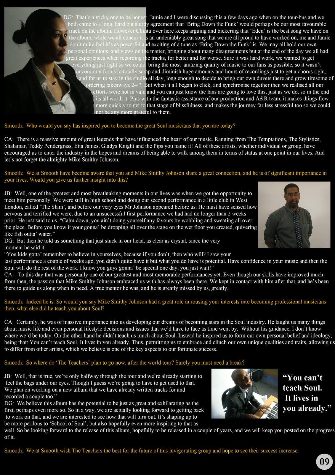
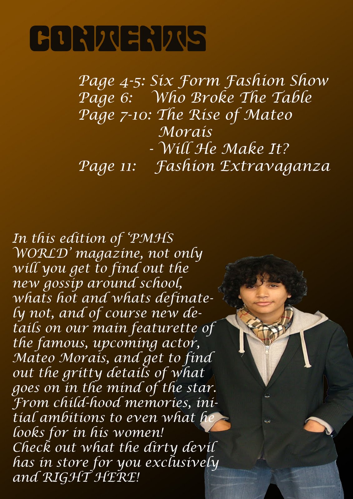
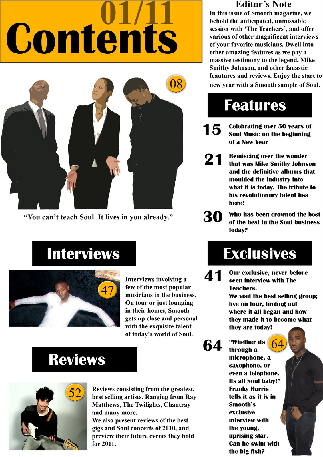
Changes were made to the Contents page and the second page of the Double Page Spread. The caption reading ‘Breaking it down like never before’ in the double page spread, and the floating quote reading “You can’t teach Soul. It lives in you already.” in the contents page, has been switched around to increase he quality within the pages.This was done because the contents page already had a floating quote, which is visible in the bottom right hand corner, and the contents page may not necessarily need to have more than one. However the double page spread only had one and there was not enough space left to leave another suitably presented one inside it, therefore having to replace the caption with this floating quote instead.
Preliminary Work

- I had tried to use a dark and warm colour scheme to reflect the maturity and higher class of the audience at had. I also used a gradient tool to give the pages a relaxed feeling, however due to this the black has been able to dominate certain sections of the page and become too dark, making the cover artist blend too much into the background and forcing me to go with a personally less desirable font colour for this type of page (white) instead of going with one I would have much preferred and believed suit these specific pages better (black).
- I got the artist to wear a blazer over his casual dress in order to convey both the middle class and the higher class, however the effects of this were not as clear as I had thought they would be when taking a second look at the pages, and could be done better for my actual music magazine.
- Direct mode of Address is apparent here which can draw the reader in.
- Font style is somewhat elegant and classy, suitable to the audience it is appealing to. The Masthead also connotes that of royalty and class as it is sort of in the theme of a deck of cards.
- In the real magazine I will need to add in a lot more cover lines, different images, better and organised layout, more information and many more features in order to create a successful product for my front cover and contents page.
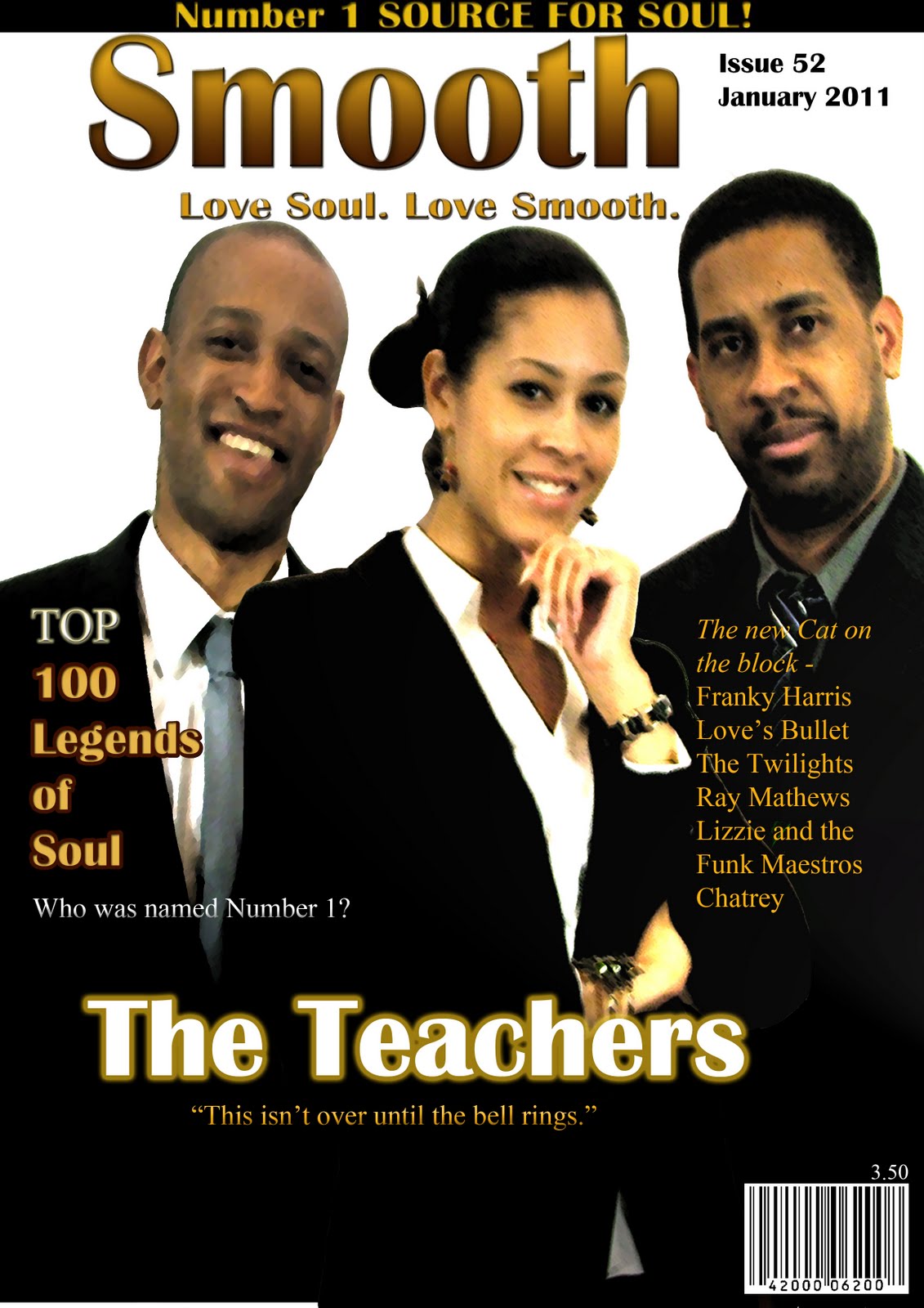
Final Front Cover – No Effects to Artists

This copy has no added effects to the artists whatsoever in order to see whether effects were truly essential and needed, or just an unnecessary add-on.
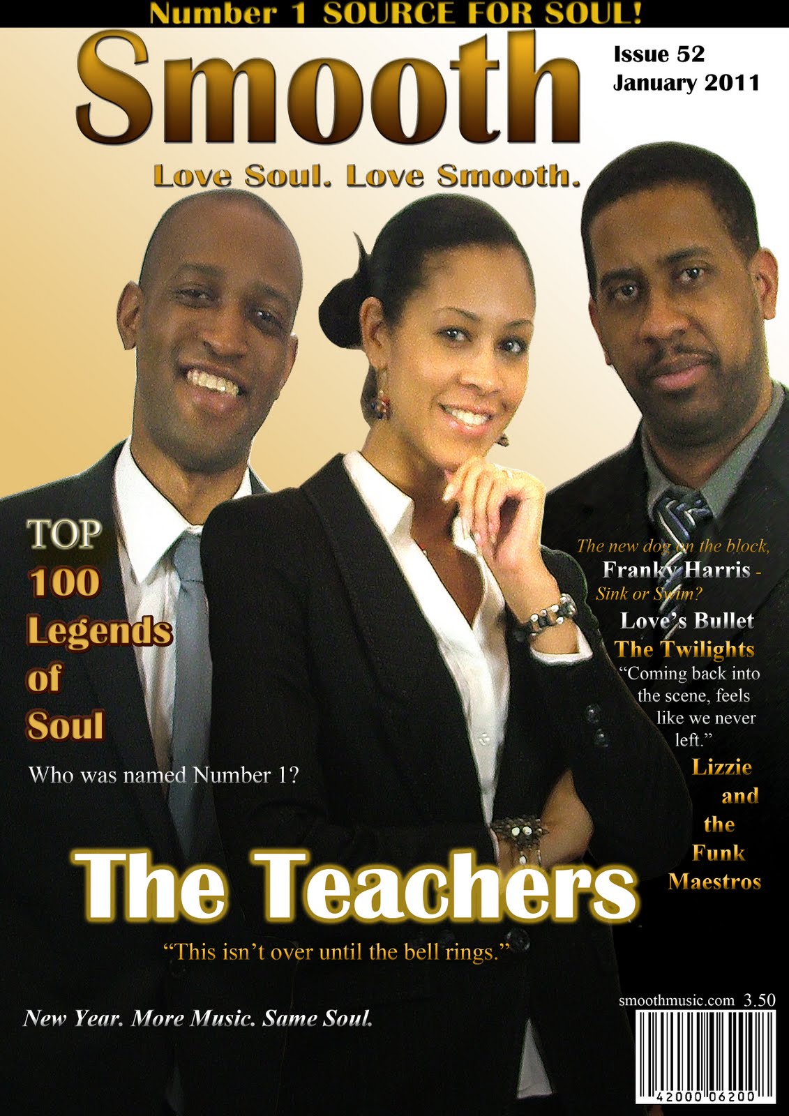
I had concluded that the images of the cover artists were fine just the way they were and there was no need for any extra effects to be applied to the images of them. Therefore I have decided that I will use this copy of the front cover instead as it would work out the best. It happens to look very simplified and still smart, which would fit in well for the genre of a Soul magazine since it holds more of a mature audience that wouldn't care much more for any extra effects added for aesthetic purposes, and wouldn't be attracted any further by excessive flashiness to the cover.
Front Cover New Copy 2 - Strong lighting on each artist
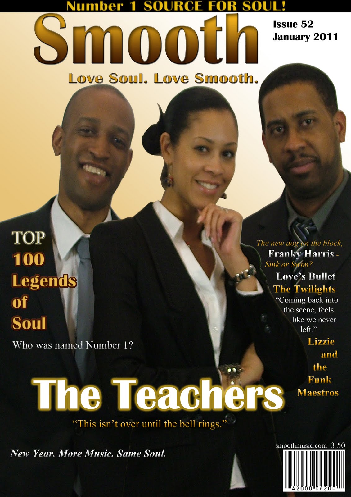
This is an extension to the copy before this and uses the effects of Omni Lighting on each of the artists but to different levels so that the cover could feel more official and professional.It may however appear as if the lighting was just a blatant gimmick used to make the lead singer, Denise Greene, stick out to an even greater extent among the other artists and just an attempt to subtly highlight her as being leader, (which is only an addition to the reasons I used the effect.)
Front Cover New Copy 1 – Sharpened images
+JPEG.jpg)
This copy of the front cover was produced in order to sharpen the images, using the Paint Daub tool, and makes them appear very vivid and clear, in order to try and increase the dynamic touch of the page and give it more of a professional feel.
Wednesday 7 April 2010
Subscribe to:
Posts (Atom)